You can quickly navigate to this page using
Learn more about all shortcuts here.
G then R.Learn more about all shortcuts here.
Overview Dashboard
At the top of the page, you’ll find a New Report button, as well as reports that you have already created.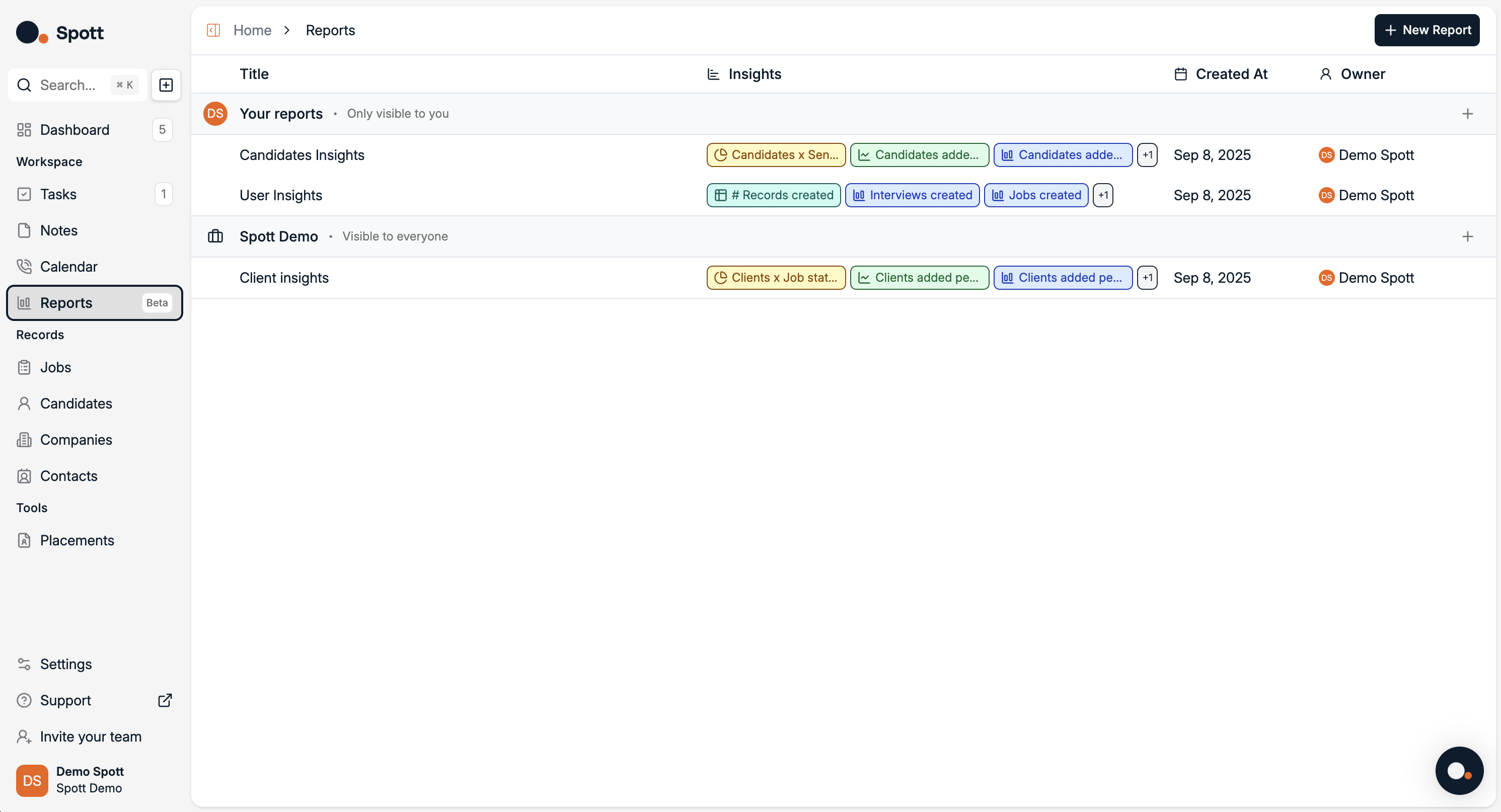
Report View
Access report view by clicking on a report or creating a new one. A report aggregates candidate data and displays it through visual dashboards.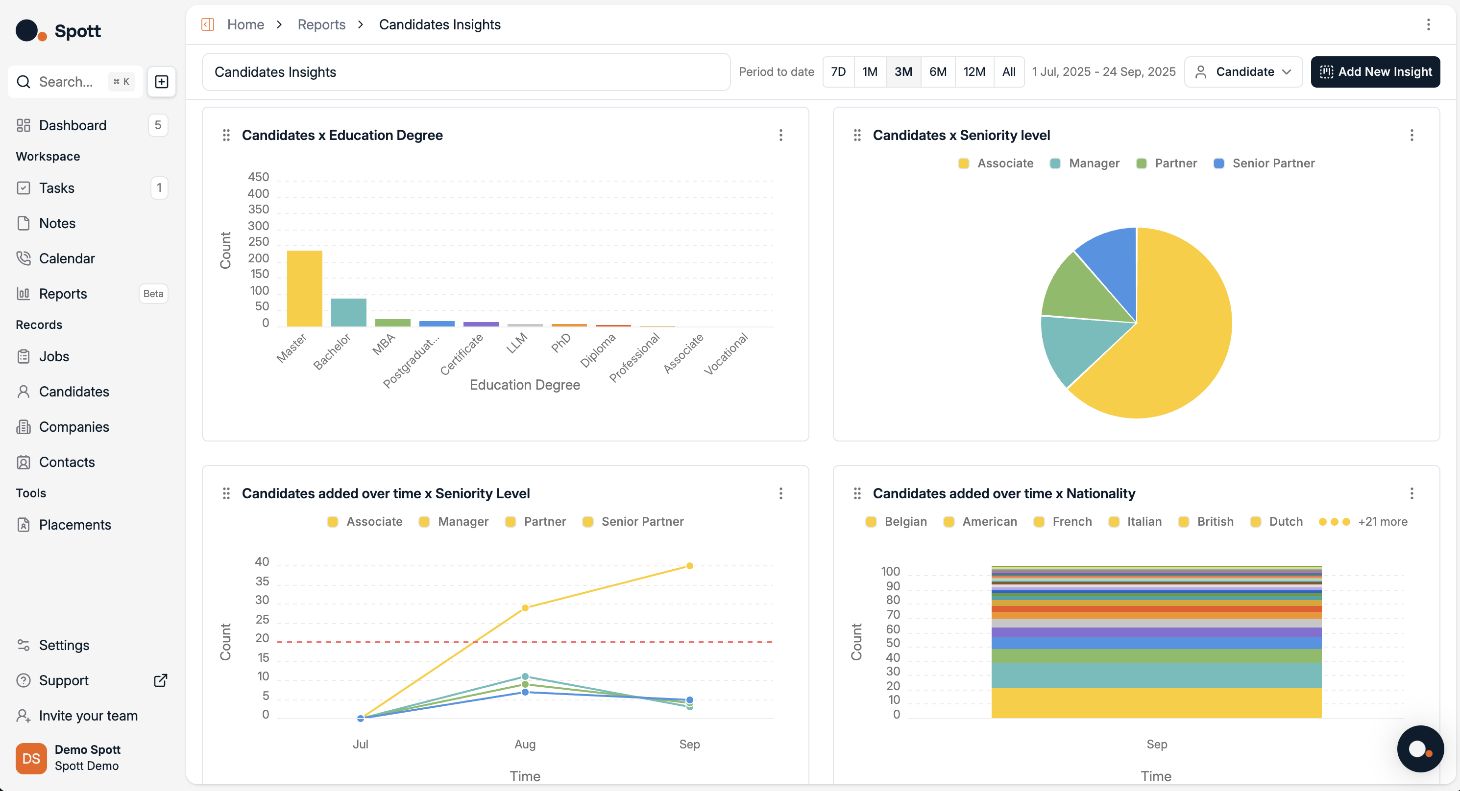
- Change the reporting period – Select from
7D, 1M, 3M, 6M, 12M, All, or set a custom date range. - Switch record type – Toggle between
Candidate,Job,Company, etc. (here it’s set to Candidate). - Add a new insight – Click “Add New Insight” to create additional visualizations with your own metrics and filters.
- Filter and drill down – Use filters (e.g., Candidate attributes, time, job association) to refine the charts.
- Customize chart type & grouping (per insight) – Each insight can typically be displayed as a bar, line, pie, or stacked chart, and grouped by different candidate fields (degree, seniority, nationality, source, etc.).
- Save or share – Insights can be saved into the dashboard or exported for presentations/reports.
Viewing and Customizing Graphs
When you edit or create a new graph, a detailed view opens where you can:- See data in graphical form (default is often a line chart).
- Change the chart type from the chart selector in the top-left corner.
- Adjust summaries for a more refined view.
- Table – Displays raw data in rows and columns.
- Bar – Compares quantities using horizontal or vertical bars.
- Line – Shows trends over time using a continuous line.
- Pie – Visualizes proportions within a whole.
- Single Metric – Displays a single metric in bold.
Switching between chart types can help you identify trends more clearly — for example, using a bar chart to compare weekly totals or a funnel chart to visualize the recruitment pipeline.
Analytics data updates in real-time based on your system’s activity, so your statistics always reflect the most recent changes.